

Array Chart
Display array data in a chart format. Supports area fills and data labels to enhance visualization.
The Array Chart widget visualizes array-based data as a chart with area fills and data labels. It renders sequences of related data points in an easy-to-read graphical format, making trends and patterns immediately visible. We recommend this widget for displaying multi-point sensor data such as temperature profiles across multiple zones, battery cell arrays, or any scenario where comparing related values at a glance is important.
Configure Array Graph
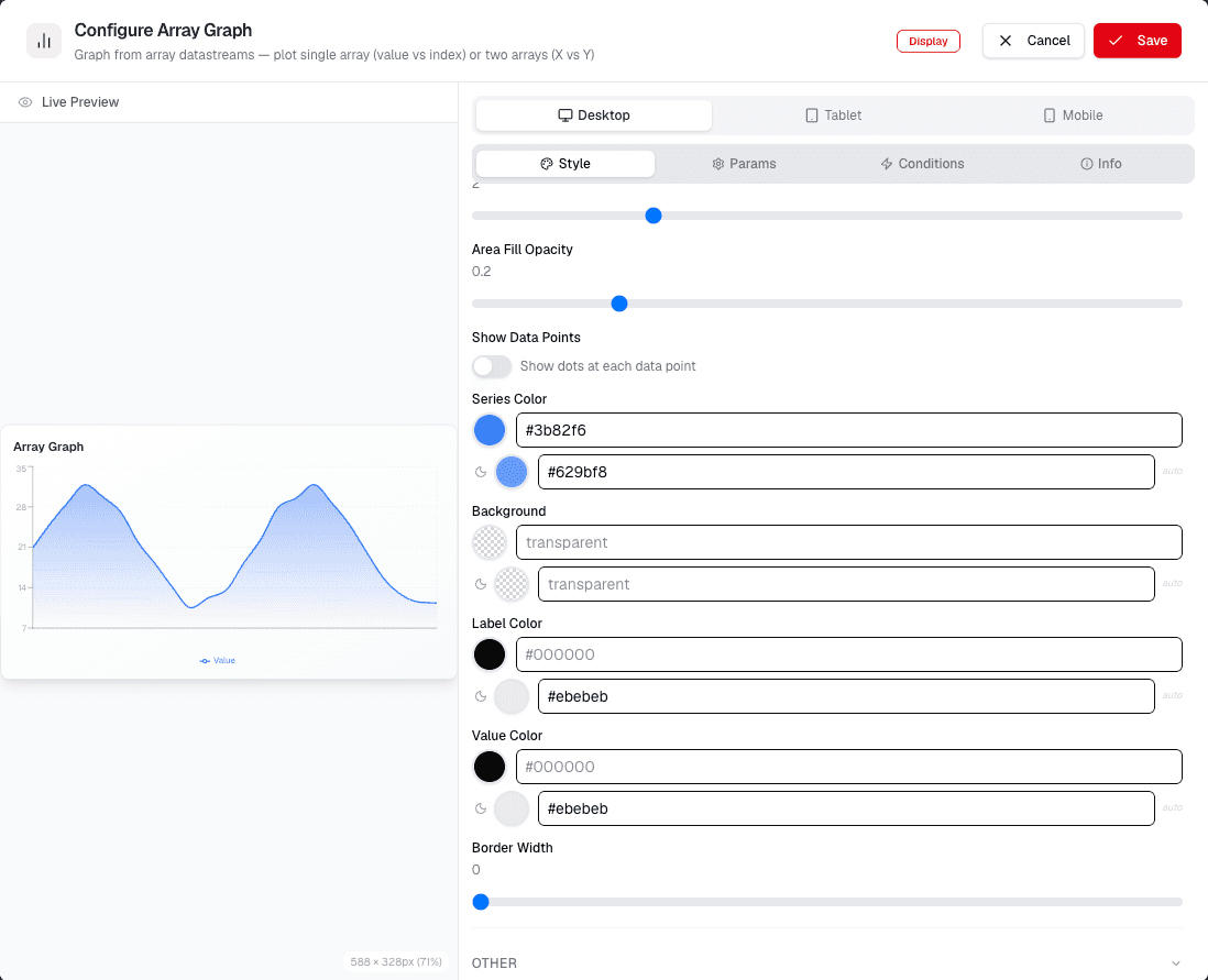
Open the Array Chart configuration screen to customize how the chart displays data.
- Select the Data Source to determine which data the chart uses.
- Set the Data Type to define how the data is interpreted.
- Adjust the Area Fill settings to control the chart's appearance:
- Area Fill: Toggle area fill on or off.
- Area Fill Color: Choose a color for the area.
- Area Fill Opacity: Adjust transparency.
- Area Fill Type: Select the fill type (e.g., solid, gradient).
- Configure Data Label options:
- Data Label: Toggle labels on or off.
- Data Label Format: Choose how labels are displayed.
- Data Label Position: Set label placement.
- Data Label Color: Select a color for the labels.
- Data Label Background Border Dash Array: Customize the label border style.
- Click Save to apply your changes.
Review Chart Preview
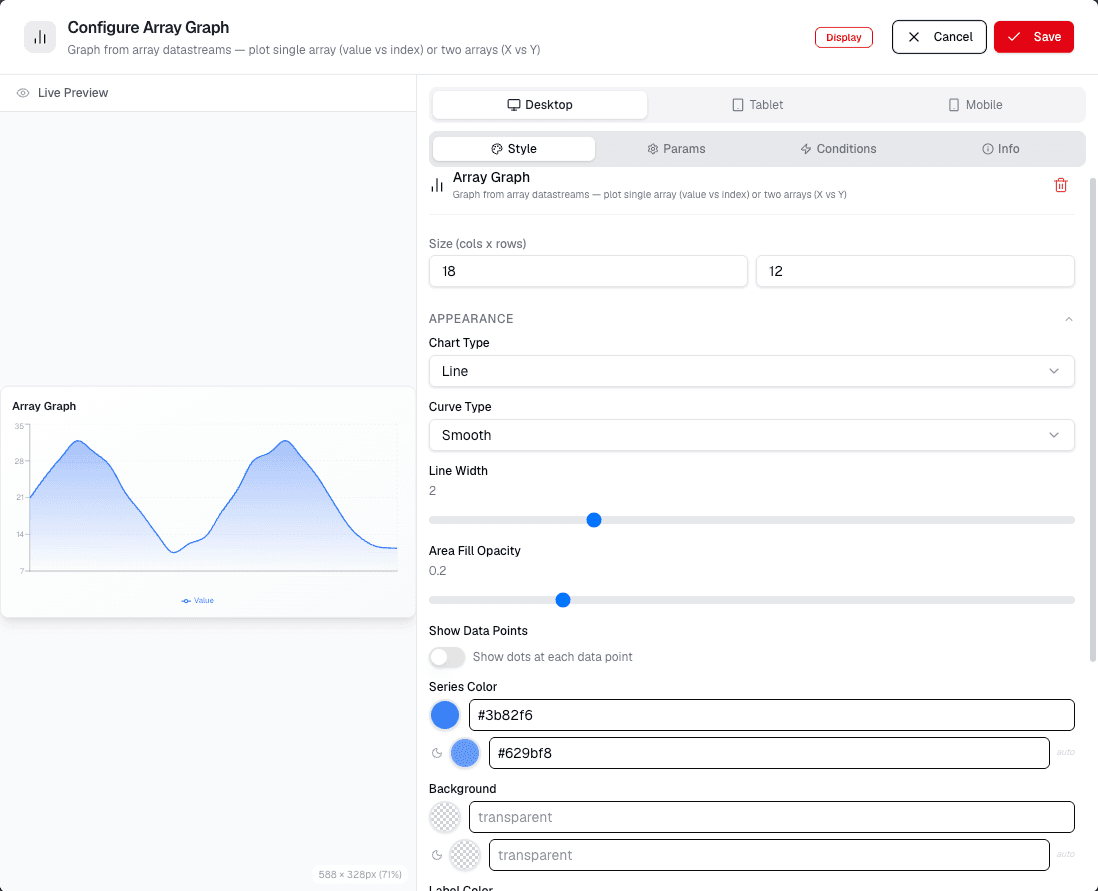
Review the chart preview to confirm how your settings appear.
- The chart displays the configured data with the selected area fill and label settings.
- If the preview does not match expectations, return to the configuration screen and adjust settings.
After saving, open the dashboard preview and confirm that the chart uses the selected source and renders array values in the expected order.