
Button
Add and configure button widgets to your device dashboard. Customize the button's appearance and behavior.
The Button widget provides an interactive control element on your device dashboard that triggers actions when pressed. It supports customizable appearance including labels, colors, sizes, and styles, and can be configured to execute specific actions such as sending commands or triggering workflows. We recommend this widget for remote device control, triggering automated actions like valve operations or pump activation, and any scenario requiring quick manual intervention from the dashboard.
Configure Button Properties
Open the button configuration screen to set up your button widget.
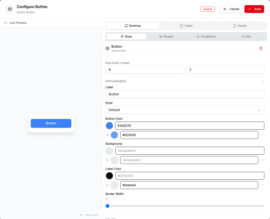
On this screen, you can:
- Set the Name of the button
- Define the Label displayed on the button
- Choose the Size of the button
- Select the Button Style
- Pick the Button Color
- Set the Background Color
- Define the Border Color
- Adjust the Border Width
After making your selections, click Save to apply the settings.
Configure the button action, label, color, size, shape, and optional trigger behavior. Use the preview area to confirm that the button looks clear before saving.
Configure Button Settings
Review the full button configuration screen to set advanced properties.
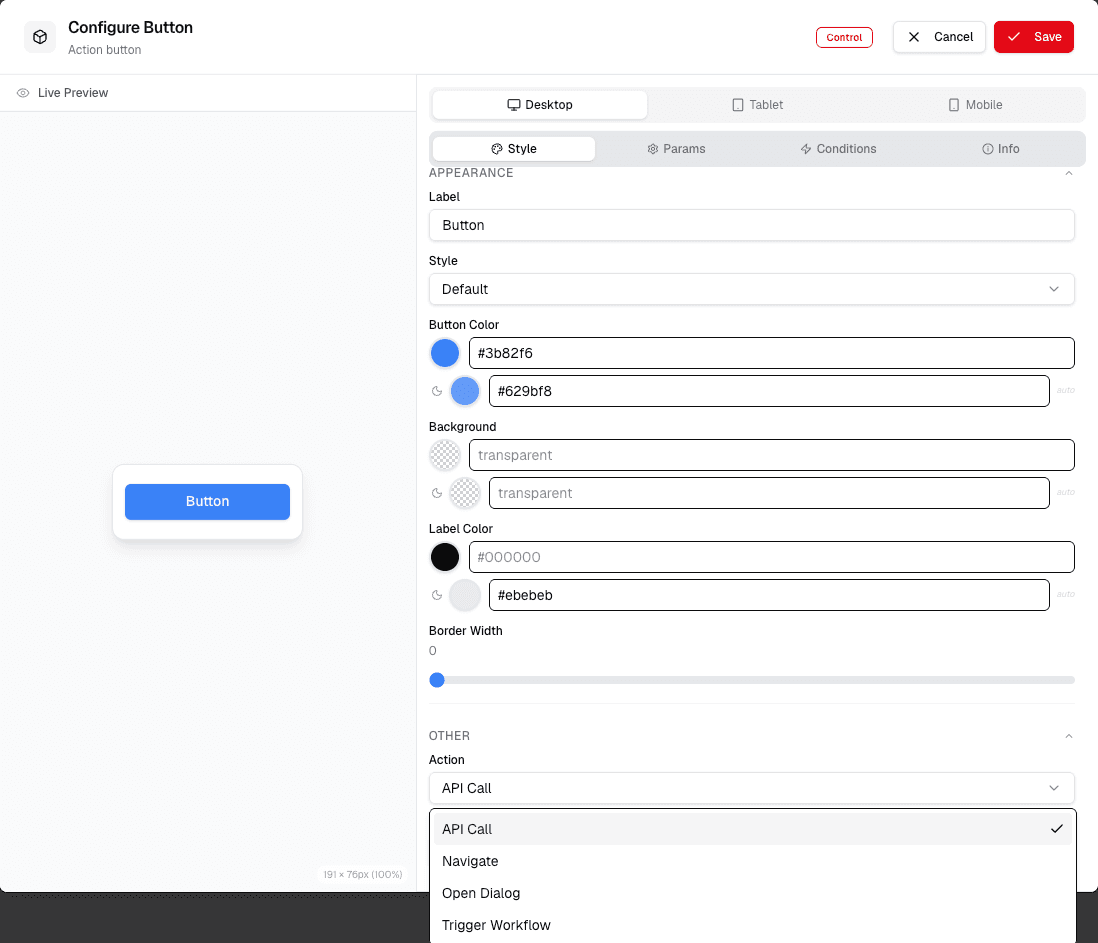
On this screen, you can:
- Enter values for Button Type
- Set the Button ID
- Define the Button Label
- Choose the Button Color
- Select the Button Size
- Pick the Button Shape
- Select the Button Style
- Enter the API Call to be triggered
- Set the Trigger for the button
Click Submit to save your changes.