

Icon
Add an icon widget to your device dashboard. Customize size, color, background, and more.
The Icon widget displays customizable visual symbols on your device dashboard. It supports configurable size (small, medium, large), color, background, border, and padding settings, with options for both default and custom icon types. We recommend this widget for indicating device status at a glance, representing equipment types such as pumps or valves, and enhancing visual recognition in dashboards where text labels alone may not be immediately clear.
Add an Icon Widget
- Open the Device Template.
- Navigate to the Device Dashboard.
- Click Add Widget.
- Select Icon from the list of available widgets.
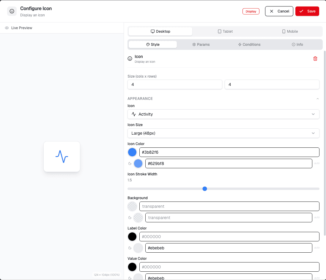
Configure Icon Settings
- After adding the widget, click the Configure Icon option.
- Select the Type of icon: Default or Custom.
- Enter the Icon name or select from the available options.
- Adjust the Size using the options: Small, Medium, or Large.
- Set the Color to Default or choose a custom color.
- Set the Background to Default or choose a custom color.
- Set the Border to Default or choose a custom style.
- Adjust the Padding to Default or set a custom value.
- Set the Border Width to Default or choose a custom width.
- Click Save to apply your changes.
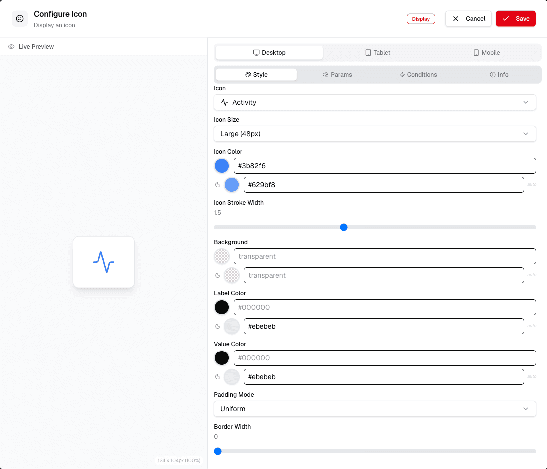
This screen lets you configure the icon settings. You can set the icon type, size, color, background, border, padding, and border width. The Live Preview tab shows how the icon will look. The Code tab lets you edit the configuration directly.
Choose an icon that remains readable at the widget size you plan to use, then adjust its color, alignment, and label as needed.